![]() Very Peri
Very Peri
PANTONE 17-3938
Original Article Published by LIV Magazine Vol 8 Issue 2
View in ISSUU Here
View/Download PDF Here
How did they know?
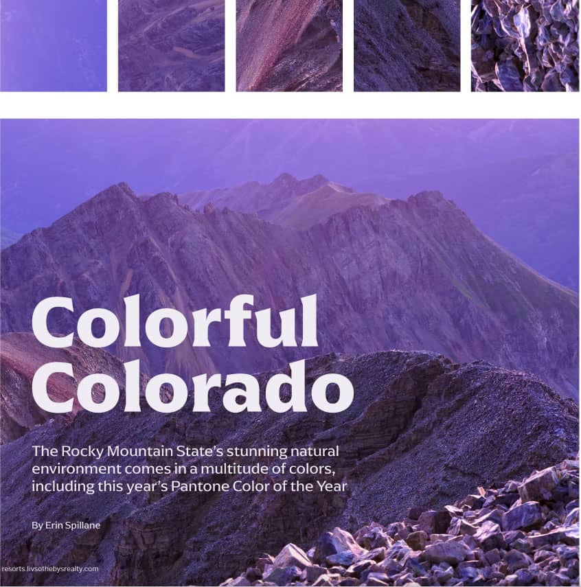
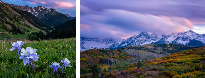
How did the experts at the Pantone Color Institute know? Had they ever spied a Colorado alpine meadow carpeted with spectacular, bluey Mountain Lupine, or glimpsed towering Pikes Peak, which inspired that timeless line from America the Beautiful about “purple mountain majesties”?
Sure, they are color experts, but were these stunning shades forefront in their minds while they deliberated the next Pantone Color of the Year from their New Jersey offices? Had the otherworldly purple-rose of alpenglow at altitude elbowed its way into their debate?
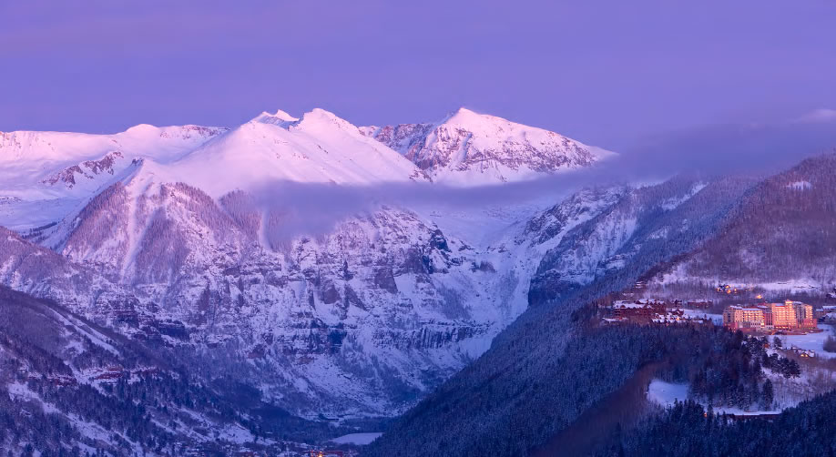
It certainly seems so, for the 2022 Pantone Color of the Year will be familiar to anyone who knows and loves Colorado’s beautiful, vertiginous natural environment. The institute’s choice? Pantone 17-3938 Very Peri, a periwinkle blue made warm with a violet red undertone that, to the delight of Colorado’s mountain town designers, can be seen pretty much daily.
“Very Peri just happens to be the color of the Columbine, the Colorado State Flower,” remarks Mary Beth O’Connor of Collective Roots Design in Telluride. “We can see this stunning flower on our hiking trails, in our own backyard and beautifully curated gardens. Lilacs, bluebells, lavender all fall in this same color family and brighten the summer palette here. It can also be seen in the alpenglow at sunset. Living in the mountains reminds us of the ‘purple mountain majesties’ that we’re so lucky to see every day.”
First, though, a note about the Pantone Color of the Year. The annual color choice is generally considered to be a reflection of the global mood, as well as a hugely influential forecast of design trends. The selection, made each December for the coming year, goes on to color, in the literal sense, everything from cell phones to sofas, instant pots to purses.
In making their announcement for 2022, the optimistic folks at Pantone seemed to reference a hoped-for emergence from the past few years, noting that “in blending the faithfulness and constancy of blue with the energy and excitement of red, this happiest and warmest of all the blue hues introduces an empowering mix of newness.”
 A Happy Color
While the region’s designers applauded the, well, Colorado-ness of the color choice, they also noted that the surprisingly striking color marks a departure from the muted shades of past years. Notes Heidi Sherratt, of Crested Butte design firm Interior Visions, “Very Peri is a surprise, and I could not be more excited to see a happy, uplifting color this year. The past few years have been heavy for so many reasons and I think we are all ready for some change. The days of shades of gray are not as appealing and our clients are looking at other ways for their homes to still feel natural, but also have some unique personality with colors. People are ready to have fun in life and in their homes, and adding a touch of color lifts their spirits.”
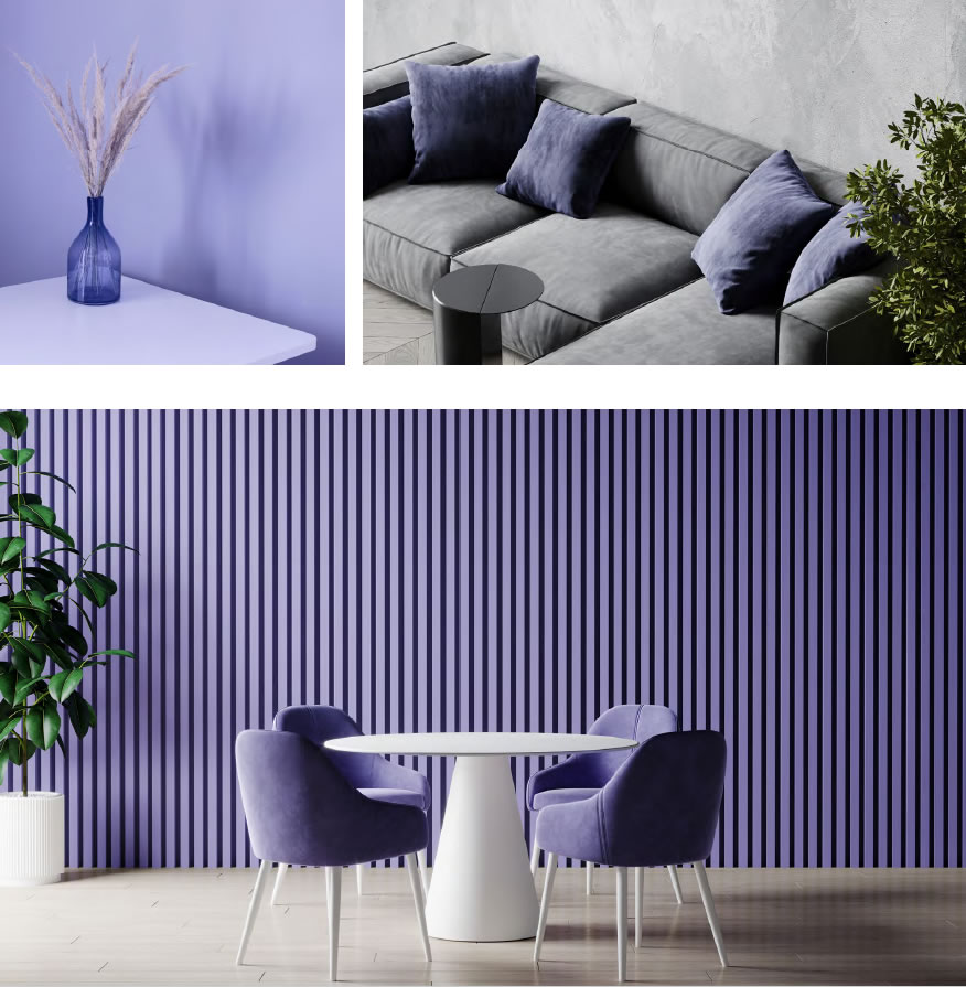
Both O’Connor and Sherratt note that while Very Peri might not be everyone’s choice of main color for an interior (yet), it certainly makes for a perfect accent color, one that works well with whites, beiges and everything in between.
 Says O’Connor, “Very Peri is a bold choice, but it introduces a color pop that still falls in with more classic, organic tones. It’s an exciting color to introduce as a wallpaper, possibly for a powder room, where you can bring in an element of surprise and have a bit more fun with color.”
She continues, “A great way to play with this color is by bringing it into the bedroom. Imagine a range of tones of Very Peri in throw pillows on a fresh crisp white duvet and accented with a new rug that also echoes the same Very Peri color palette. Accessories, artwork and fresh flowers can also add to overall finished design.”
Sherratt agrees. “Pillows, bedding, wallpaper, and decorative items are the way we mostly bring color into our clients’ homes. We have seen a new interest in using colors for paint on the walls in the bedroom. Bedrooms are a great place to add color on the walls if you are feeling bold. You can keep the bedding light and neutral using natural linen duvet covers and crisp white sheets, then add some color in the decorative pillows, artwork, rugs — and the room feels warm and happy.”
“I think that Pantone’s choice of color this year is a challenge
to everyone to think about how colors make them feel.”
– Heidi Sherratt
 Fun & Fresh
Talk to these popular designers about integrating Very Peri into current projects and the word “fun” comes up a lot.
“For the right clients, it could be the perfect color to upgrade a teenage girl’s bedroom,” O’Connor says. “Fun artwork and this new fresh color will inspire and provide a creative base for the young girls that get excited to change their personal space. I like to give them some freedom to play and be involved in the process.”
Adds Sherratt, “We have not used a ton of color in the last four years, but we are actually working on a farmhouse-style home right now and it is full of color. The cabinets are all different colors in the kitchen and bathrooms, along with fun colorful tile everywhere, and even a blue-painted trim around the windows inside the house. Every time we meet with these clients and pull out their samples, it simply makes me smile. It is a very unique style to this mountain area, but we are loving it. It feels fresh and yet still classy and timeless.”
Sherratt continues, “I think that Pantone’s choice of color this year is a challenge to everyone to think about how colors make them feel and, whether it is a periwinkle blue or some other color, maybe it is time to bring them into our homes and have some fun.”
Both designers note, though, that colorful Colorado’s outdoors offer up an even wider array of colors, making these designers’ palettes varied beyond Very Peri. Think the gold of autumnal aspens, the multitude of greens that cascade below treeline, or the greys and rusts above it, the frosty white of winter, or the bluebird skies for which Colorado is famous. It’s a delicious panoply to tie into their interiors, no?
“So many of the homes we design have stunning views of the mountains that surround us,” Sherratt explains. “It is a huge element that we like to bring inside the house and the colors of nature are a mix of everything from bold and bright to muted and neutral. If you truly look around there is not a color that is not out there in nature and they are all beautiful.”
“Living in the mountains does remind
us of the purple mountain majesties
that we’re so lucky to see every day.”
-Mary Beth O’Connor